微信小程序开发flex布局方法和案例说明
1、flex-direction属性表示布局的方向 有两个值: row | column 默认属性是row 行布局,先来看看flex-direction:row的效果
<view class="section">
<view class="section__title">flex-direction: row</view>
<view class="flex-wrp" style="flex-direction:row;">
<view class="flex-item bc_green">1</view>
<view class="flex-item bc_red">2</view>
<view class="flex-item bc_blue">3</view>
</view>
</view>

2、flex-direction: column属性,代码:
<view class="section">
<view class="section__title">flex-direction: column</view>
<view class="flex-wrp" style="flex-direction:column;height: 100%;">
<view class="flex-item bc_green">1</view>
<view class="flex-item bc_red">2</view>
<view class="flex-item bc_blue">3</view>
</view>
</view>

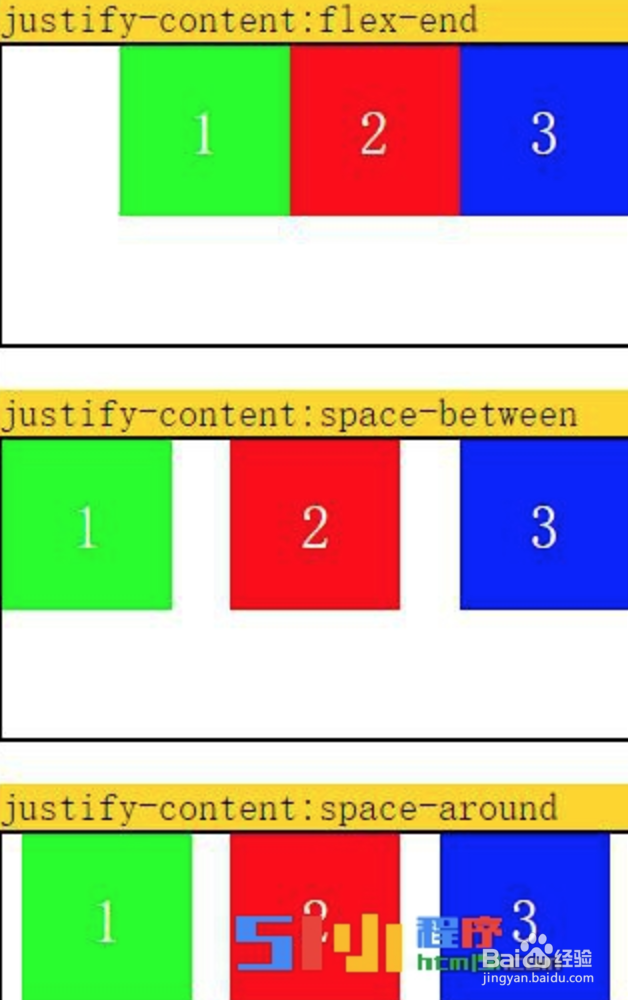
3、另外布局样式中,除了flex控制外,还可以有另外两个样式属性,如下是其中一个justify-content.justify-content
justify-content:弹性项目在主轴main-axis线上的对齐方式; 值:flex-start | flex-end | center | space-between | space-around (注:当横向排列时 主轴就是x轴;反之则是y轴。)
justify-content:flex-start,源码(整个源码包可以在http://bbs.html51.com/t-425-1-1/下载):
<view class="section">
<view class="section__title">justify-content:flex-start</view>
<view class="flex-wrp" style="flex-direction:row;justify-content:flex-start;">
<view class="flex-item bc_green">1</view>
<view class="flex-item bc_red">2</view>
<view class="flex-item bc_blue">3</view>
</view>
</view>

4、flex-end | center | space-between | space-around 值同理,样式效果如下:
5、除了justify-content外,还可以通过下面的align-items属性来控制布局。align-items
align-Items表示在垂直方向上的布局情况定义在父级容器中; 有 flex-start | flex-end | center |stretch 四个值。
align-items:flex-start;代码如下:
<view class="section">
<view class="section__title">align-items:flex-start;</view>
<view class="flex-wrp" style="flex-direction:row;align-items:flex-start;">
<view class="flex-item bc_green">1</view>
<view class="flex-item bc_red">2</view>
<view class="flex-item bc_blue">3</view>
</view>
</view>

6、align-items:center;
代码:
<view class="section">
<view class="section__title">align-items:center;</view>
<view class="flex-wrp" style="flex-direction:row;align-items:flex-start;">
<view class="flex-item bc_green">1</view>
<view class="flex-item bc_red">2</view>
<view class="flex-item bc_blue">3</view>
</view>
</view>

7、align-items:flex-end;
代码:
<view class="section">
<view class="section__title">align-items:flex-end;</view>
<view class="flex-wrp" style="flex-direction:row;align-items:flex-end;">
<view class="flex-item bc_green">1</view>
<view class="flex-item bc_red">2</view>
<view class="flex-item bc_blue">3</view>
</view>
</view>

8、以上就是强大的flex布局常用的一些属性说明了,代码也很清楚了,其实flex是最基础的方式了,也是最常用的布局方式,在大家开发微信小程序的过程中一定会用到。